Alain Pinel Realtors
The Story
Alain Pinel Realtors (APR) was a family-owned residential real estate company in California with a focus on luxury properties. They'd already dominated the largely print-based real estate advertising arena for over 20 years when I joined the team full-time to refresh their outdated materials and expand that reputation into the digital landscape.
The Execution
Since real estate marketing predominantly consists of high-quality staged home photography, the weight of APR’s visual identity was in its typography. We upgraded the extravagant print-based script fonts historically used to express their specialty with luxury properties to similarly opulent web fonts that added flexibility while maintaining unity across their branded experiences.
Above: Examples of the brand-specific font conversions.
To pre-launch the refreshed identity, we paired the new typography with stock photography to create a set of seasonal e-cards for the company's 1400 agents to share during the holiday season.
Above: A selection of the various e-Cards created in theme with the rebranded fonts.
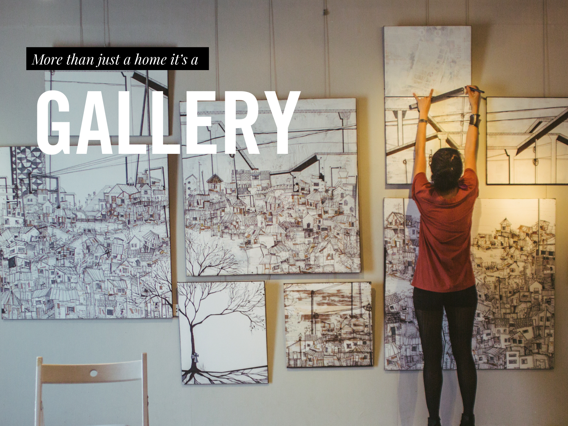
For the full external launch of the campaign, we featured the new fonts over immersive real estate photography and inspirational lifestyle photography in a campaign that captured the feeling of ‘home’ in various settings and we distributed updated assets across their advertising partners and published a redesign of their website homepage.
Above: A selection of themes I created for use throughout the campaign.
Weekly Newsletter Redesign
To fully unify the external and internal communications, I applied the updated typography treatment to stylized text throughout the weekly internal newsletter. I brainstormed with the veteran print-focused designer to choose a style similar to a traditional old-school newspaper bulletin. I also collaborated with the full-stack developer and provided the base CSS and ongoing code edits to tighten up the implementation of these graphic-driven layouts.
Above: A selection of weekly emails that I designed to be in theme with the typography rebrand.
Annual Review Infographic
Celebrating 25 years of Excellence, Alain Pinel Realtors showcased some of their proudest moments and statistics in a large infographic. I dug into modern implementations and visualizations of icons and data, and this classic style evolved.
Above: The final 2014 annual review poster graphic.
After stellar internal reviews and feedback, I molded the more extensive infographic into multiple consumer-facing marketing slicks in the same style. Using long-standing knowledge, some of our follow-up pieces provided an opportunity to reiterate the company’s strengths: local markets, global presence, luxury affiliations, and innovation tactics.
Above: The additional promotional posters created for recruiting events.
Video Post-Production
Throughout my time with APR, the marketing department refocused on producing and promoting in-house video content. This project showcases the design direction and final released versions of four seasonal videos for which I completed all post-production editing, working with cuts, audio, grading, and polishing the overall delivery.
Above: Thumbnails created for various seasonal marketing videos.
Event Branding
As part of the digital brand refresh, we extended the fonts, themes, and photographic styles through smaller micro-branding opportunities for various internal and external events. We created a text lock-up for each event to feature alongside vibrant images and polished graphics throughout landing pages, third-party RSVP integrations, email correspondence, and in-person environmental signage.
Above: Mock-ups featuring the invitations and landing pages I created for various internal and external events.
Don't be a Stranger!
❊
Don't be a Stranger! ❊


