
Integral Development
The Story
Integral Development is a long-standing international financial technology company working to establish itself as a leader in the industry. As a part of the in-house marketing and design team, I sought out the task of updating the designs of the booths used at international trade shows. With the objective of more uniquely resonating with the local markets, I pushed for full use of the brand's visual identity to execute vibrant and immersive booth experiences.
Istanbul, Turkey
In Istanbul, we used recognizable landmarks from the United States and Turkey to convey international transparency. Instead of relying on the primary American blue color, I was inspired by Turkey's vibrant culture to choose to use various tones of Integral's normally tertiary orange brand color. Using the monotone palette and translucence, I added depth to the different levels of landmarks. While this color was a risk for the brand, it was perceived as a show of confidence and a considerable draw-in for attendees.


Above: The original website Home Page design alongside the redesigned page.
China
In Macau, I elevated a secondary red color from the brand's palette to prominence in celebration of the Chinese New Year. Consulting with various resources on the best approach, I learned that red was culturally appropriate for celebrations, specifically around prosperity. I designed the horse in cloud graphic as a play on the Year of the Horse and Integral's cloud-based service offering and used it both on the booth and in presentations, advertisements, and red envelopes to pass out as gifts.


Above: A selection of the redesigned interior pages.
Colombia
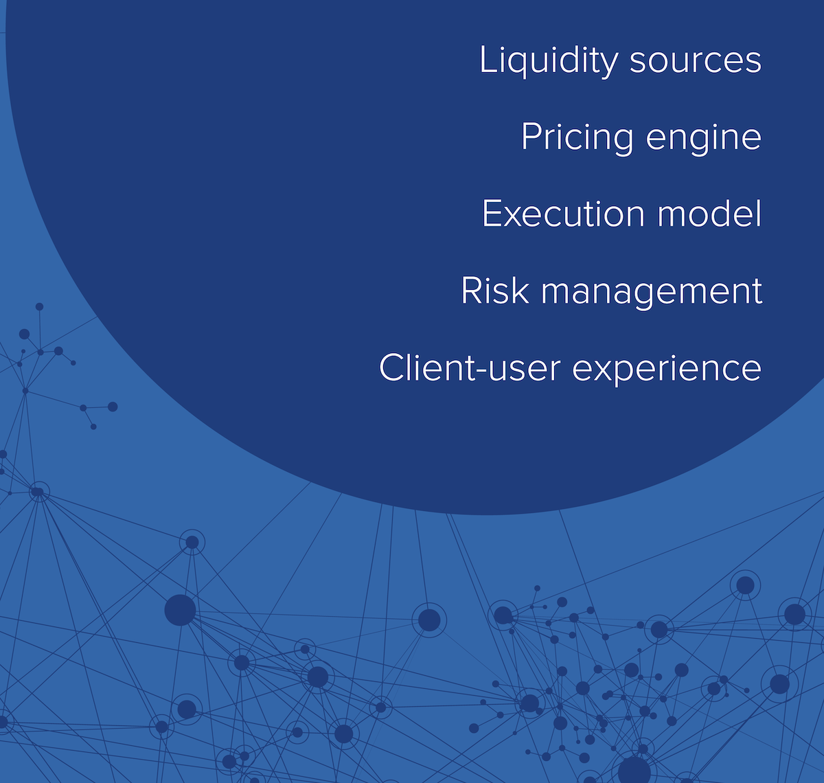
In Asofondos, I refocused on the brand's primary blue color to establish designs that could be used more generically. Rather than prioritizing the inclusion of the local market, I developed an organic hub and spoke grid to communicate the real connections made by their global network used by companies of all sizes. I also reinterpreted the technique from our booth in Turkey, using a more generic set of internationally recognizable landmarks to design reusable pop-up banners that framed the event's entrance.


Above: A selection of the redesigned emails sent throughout the year.