Red Harp
Brand & Identity
I worked with the marketing director to reorganize Red Harp’s communications strategy. We moved away from aspirational messaging to highlight the results of the company's underlying solutions-based business strategy.
With no budget for actual office photoshoots and a unanimous preference against stock photography that wouldn’t accurately represent the team, I gathered and presented options for alternative graphic styles and treatments. We settled on a series of vector illustrations from a single artist and adapted them to Red Harp's renewed color palette to integrate them into the brand.
As the Art Director, I needed to focus on extrapolating the brand cohesively across all touchpoints rather than executing each piece. Choosing an artist with an extensive profile gave us access to a library of assets we could test and customize without extended production time.
Website & Pitch Deck
I redesigned the website to reflect the visual identity refinements, then built and launched it on Wix. I also updated the pitch decks, referencing the refreshed brand narrative to emphasize the value of their experience and results.
Above: The final designs for the website before implementing it in Wix.


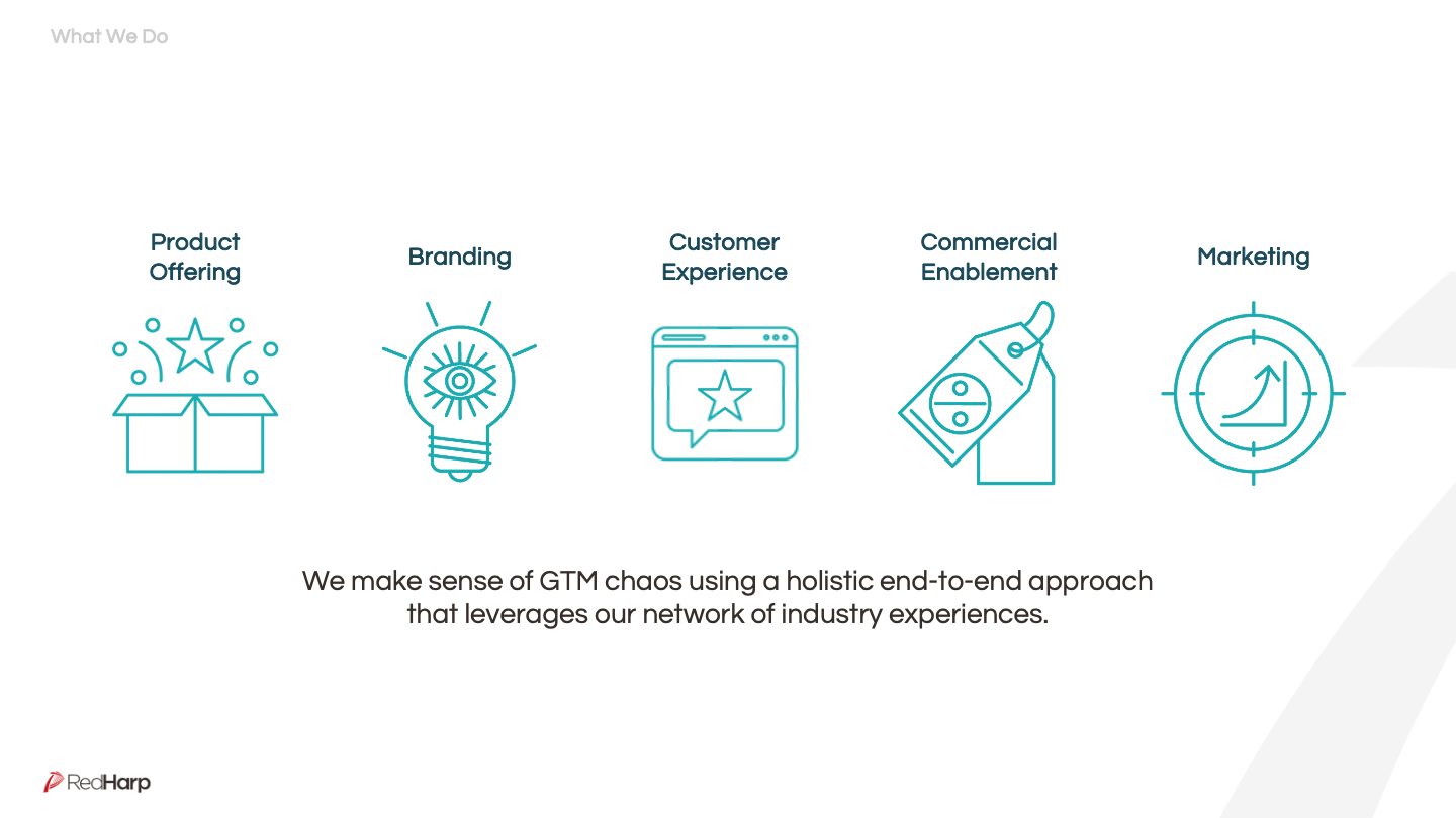
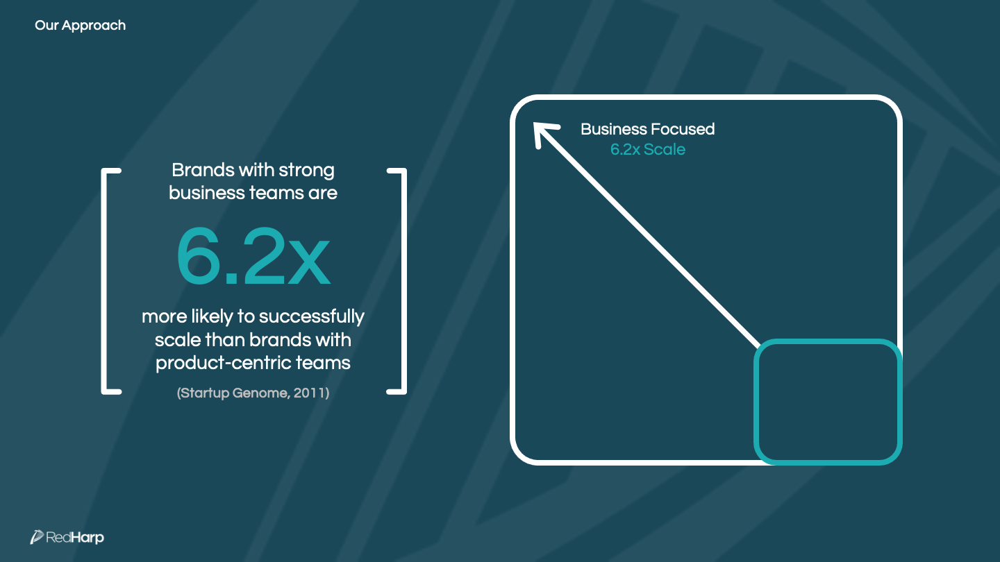
Above: A selection of slides from the redesigned brand story and pitch decks.
Client Work
Red Harp’s clients were mostly international products looking to reach the US market. As Art Director, I facilitated and executed all branding and design ideas with clients using meticulous pitch decks to recommend and coach through progress and suggestions.
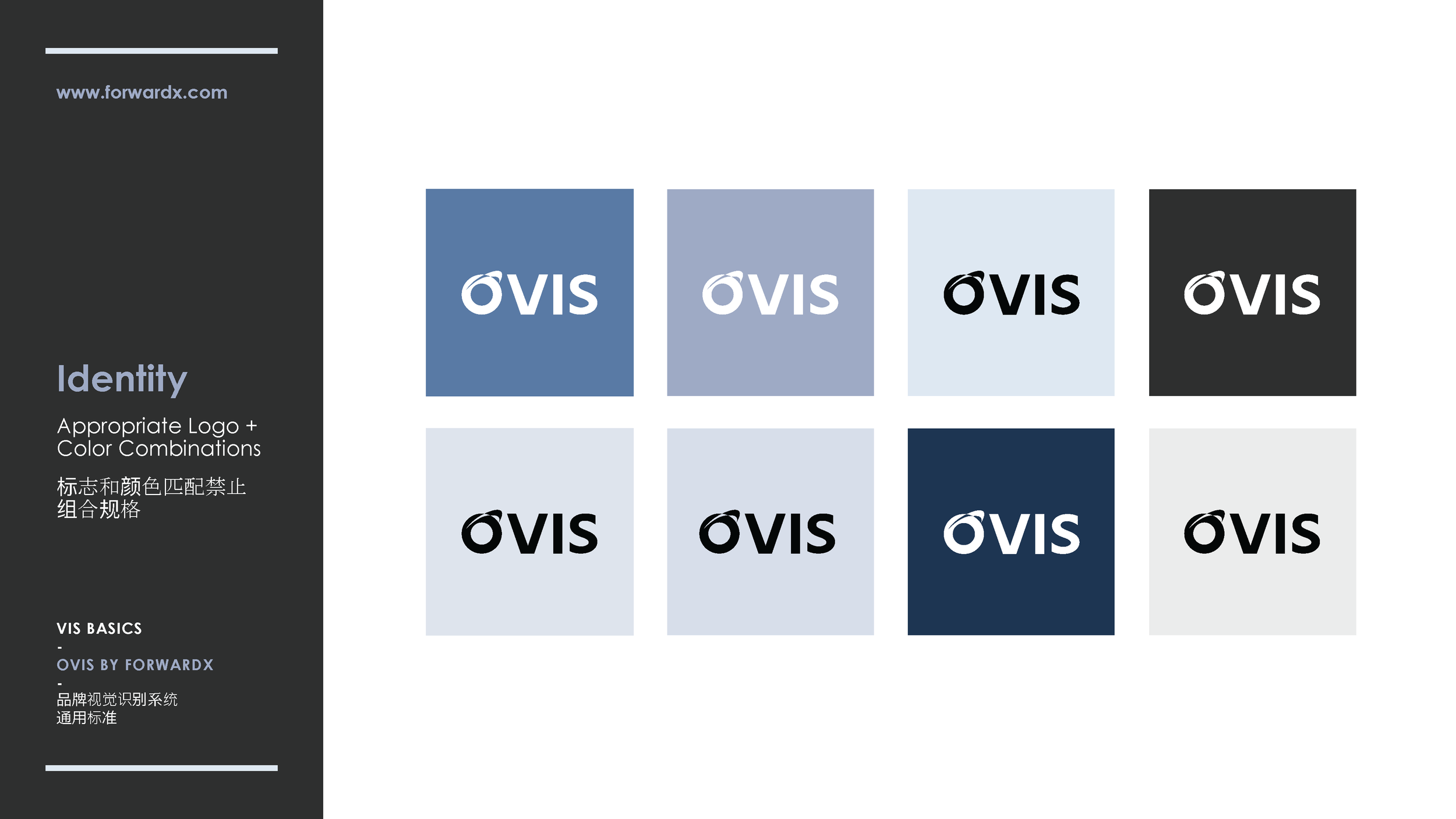
Above: Select pages from a client’s visual identity update pitch deck.
Above: Concepts for a client website Home Page redesign.


